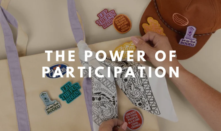
The 2026 Trend Edit
The 2026 Trend Edit is your curated guide to the trends shaping what’s next, from
We’re honored to share that MadeToOrder’s marketing rebrand was recognized with a 2026 PPAI Pyramid Award, earning Gold in Marketing Programs – Branding Campaigns.
The PPAI Pyramid Awards represent one of the industry’s highest honors, spotlighting the most creative, strategically executed, and technically excellent work—recognizing companies that consistently raise the bar in how they serve their clients.
While we’re incredibly proud of the outcome, this recognition isn’t just about updated visuals or a new logo. For us, the rebrand marked something much bigger—a season of clarity, alignment, and intentional growth.
It was an opportunity to step back and ask deeper questions: How do we want to show up? What does our brand need to communicate? And how can we build an identity that reflects the experience we strive to create for every client, every partner, and every end user?
In this post, we’re sharing the thinking, strategy, and key lessons behind the evolution of the MadeToOrder brand—and why this work mattered far beyond the creative.
Pictured left to right: Brittany Frase, Sandy Gonzalez, Stephanie Hinkle
The MadeToOrder rebrand was born out of both necessity and opportunity. With the industry announcement of our acquisition of RED Promotions on the horizon, timing was critical. We needed a refreshed brand identity ready to roll out before the news broke so that every touchpoint—communications, merchandise, and social media—aligned seamlessly with the new chapter.
The old logo felt out-of-date, lacked meaning and storytelling power, and was difficult to use across merchandise and digital platforms. It didn’t reflect the creativity, sophistication, or connection at the heart of who we are. An overhaul wasn’t just beneficial—it was essential.
48 hours.
Given the highly confidential nature of the pending merger-acquisition, we weren’t able to share details with the team until just before the announcement. With so many priorities in motion, marketing and communications weren’t brought into the process until the last minute, leaving very little time or runway to prepare. Nonetheless, Stephanie Hinkle rose to the challenge.
In just two days, she developed:
This wasn’t just a design sprint—it was a full-scale rebrand executed at lightning speed. What makes it truly remarkable is that the output wasn’t just “done fast”—it was thoughtful, strategic, and infused with meaning, positioning MadeToOrder as a stronger, more connected brand at the exact moment the industry was watching.
Rebrands often take months, if not years, to research, design, and launch. Delivering a complete, story-driven rebrand in 48 hours—and having it hold up to industry scrutiny and client engagement—was nothing short of extraordinary.
Ever feel like you’re on the verge of something amazing but you just need to connect a few more dots? That’s exactly what our rebrand represents.
Our logo is simple in form, yet layered in meaning. The three dots are inspired by the familiar “chat” typing symbol, representing anticipation, connection, and collaboration—the starting point of every great idea. They also reflect the “idea loading” moment, capturing the spark of creativity in motion and the promise of what’s about to take shape.
To amplify this, we use bold, vibrant colors that embody our brand personality: energetic, modern, and unapologetically creative. Just as our work brings brands to life through purposeful merchandise, our color palette brings energy and visibility to our identity.
Together, the dots and colors tell our story: a brand built on conversation, connection, and creativity—always in motion, always ready to help you connect the dots.
Following the whirlwind 48-hour rebrand, Stephanie carried the momentum forward into one of the most ambitious projects yet: building an entirely new website for MadeToOrder from the ground up.
This was not a simple facelift. The site required complete architecture and execution—including content strategy, copywriting, layout, graphics, functionality, custom photography, team bios, and dynamic pages to showcase the brand. With no formal web-building background, Stephanie taught herself the technical tools and platforms needed to make it a reality.
In under four months, she:
The result is more than a website—it’s a digital ecosystem. The site now serves as the central hub for content, campaigns, and communications—supporting client engagement, supplier partnerships, and industry visibility.
What makes this achievement particularly remarkable is the timeline and skill gap. In an industry where websites often take a year or more and require specialized teams, Stephanie delivered a fully functioning, multi-channel digital presence in just four months—self-taught and self-executed.
This work solidified the rebrand, gave MadeToOrder a bold new digital front door, and established the brand as forward-thinking online as it is in the marketplace.
Related Posts

The 2026 Trend Edit is your curated guide to the trends shaping what’s next, from

Sandy Gonzalez has been named #42 on ASI Counselor’s 2025 Power 50 list, recognizing the

MTO Joins Reciprocity Road To Bring Safe Water To A Mexico City School